Thursday, 16 January 2014

Reflecting on my Extended Essay

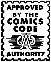
Having finished my extended essay, I am now beginning to reflect on whether I felt it to be a successful academic text. I was rather happy with the results, as I picked a topic that I found really engaging, particularly the post 9/11 theory. On his note however, I feel that given a greater word count, I could have elaborated on some of the pre-9/11 issues. My essay was rather sparse regarding the history of the comic book. Although I discussed the idea of left-wing and right-wing storytelling and the emergence of graphic novels, I could have discussed pivotal moments in the progression of comic book narratives, for example Marvel's choice to publish an issue with the Comics Code Authority seal of approval:


This was so that Marvel could tell a cautionary tale on drug use, drugs being a topic off-limits in accordance to the CCA. This paved the way for more convention breaking narratives that discuss harsh real world issues, instead of presenting us with fantastic worlds where good triumphs over evil.

Also, I could have discussed more major conflicts and how they dictated narrative:


By looking more in-depth at the Cold War in particular, I could have made more parallels between 1980s graphic novels, and post 9/11 media, and how they reflect western ideology in times of conflict.

Overall, my essay was very heavily weighted towards post 9/11 theory, and could have discussed the evolution of the comic book more thuroughly.


Loosing Patience With 24


Many of the academic texts I have been reading regarding post 9/11 propaganda feature television series 24 as key points of discussion. So that I could discuss this in a more informed manner, I ordered the complete season one on dvd. Although the show is heavily criticised for being ridiculously right-wing, I went in with an open mind, thinking that although maybe I was against the present ideologies of interrogation and surveillance culture, I would maybe find interest in the characters and narratives. Unfortunately, I found neither to be remotely engaging. The premise just seemed silly. At the drop of a hat anti-hero Jack Bauer would suddenly knock a superior out cold, or chop a terrorists thumb off. You'd think that this would be to challenge us and make us question his chaotic character, possibly being the whole idea of the show, but instead every acton Bauer takes is successful in apprehending terrorists.

Personally I prefer the show Homeland. The narrative similarly addresses counter terrorism and surveillance culture, but in a much more ambiguous and challenging way. The central character in the show is actually a former U.S Marine turned terrorist. We learn that while being held hostage by terrorist Abu Nazir Soldier Nicolas Brody develops a close bond with his abductor's son. The Child is later killed by U.S Military drone strikes, and the reports that they destroyed schools full of innocent children in the east are covered up by American news broadcasts.

It seems that Homeland gives a move rounded and honest view of terrorism and Surveillance Culture, whereas 24 celebrates the notion of torturing terrorists and spying on society.


Wednesday, 15 January 2014

Creating Environments and Refining my Narrative


Here is the first image that I produced when considering the city that my characters exist within. Looking back I am rather unhappy with the quality of this image, particularly in relation to the length of time it took. I wanted to portray the city as an open place where every action you take is visible to all, but feel I didn't really capture that as the buildings seem quite clustered and the windows aren't as large as I had intended. The only element I really like is the sinister billboard showing the capitalist hero. The slogan celebrates the way that the CEO monitors citizens "for their own protection". 'Watching over you' sounds wholesome and comforting, whereas beneath the charming text there are twisted intentions. It also shows the capitalist character as a brand, or a consumer commodity. He is trying to sell his ideologies, making us question whether he has genuine concern for anyone within the city.

I also wanted to consider other possible environments, so I produced some thumbnails:


The top two thumbnails are spaces that my vigilante would exist within, a sort of industrial wasteland on the edge of the city, and a sewer beneath all of the surveillance equipment. The top left concept is distorted by mist, and the sewer is a dark maze making them good locations to avoid being seen. The colours are cold, using the greens that we associate with vigilantes Green Arrow and Robin Hood, but also gives a certain sense of toxicity, communicating the vigilantes more dark shadow dwelling persona. It also could be taken as the notion of ugly truths. The environments the Vigilant lurks within aren't exactly pretty. The Bottom Capitalist environments on the other hand are much brighter and warmer. they feel much more open and visible, the office space giving a panoptic view of the city.

The necessity to produce an A2 poster for our final submission offered me and interesting opportunity to 'res up' and produce a higher quality image using some matte painting techniques. This next piece acts as my final image that ties together my character and environment elements, as well the backdrop for my academic poster. I wanted to depict a dramatic battle scene between the two central characters. To achieve a detailed and dramatic scene, I used lots of phototextures, and painted over them:


This image includes elements from my initial city concept, with the nostalgic billboards and warm colours. At this stage, I also began considering my narrative more. I had been toying with the idea of naming my city, but decided to heighten my narrative's relevance by setting it in 'New Manhattan'. I wanted to reflect post 9/11 agenda, but in an alternate reality where a similar catastrophe took place in Times Square leading to a heightened Military Industrial Complex, a theory on war and consumerism that I discuss in my essay. Similar to the impact the graphic novel and film adaptation 'V for Vendetta' had, I wanted my vigilante to be at the helm of a social revolution, his followers adopting the title 'The Sad Clowns'. I began naming my characters. I wanted my vigilante to have a wacky name, juxtaposing a comical title with a sense of despair, so I went with 'Dr. Desolation'. I went with the name Paul Bates for my rich CEO, calling his superhero alter ego 'The Warden'. This scene shows the aftermath of an explosion orchestrated by The Warden, as a means of thinning The Sad Clown's numbers at a demonstration, and framing them as Western hating suicide bombers.

With the presentation of my Academic Poster I initially had trouble with the text being legible over the image:


Here is a revised approach:


I was hoping to have the image more visible through the text boxes, but based on feedback and reflection, the legibility of the text proved more important. The approach of presenting an academic poster proved more enjoyable than a written evaluation. It inspired me to take on a more grand approach with my work, something tighter and more rendered. I was at this point planning on putting a cap on my practical work to focus solely on writing my extended essay. When I felt my essay was near completion however, I thought back to some of the thumb nails and decided that I could explore the space in which my characters exist more. This first concept shows another action scene. The aim was to create something fast with phototextures, achieving a level of detail that would take hours otherwise:


although I often feel I am cheating when relying heavily on phototextures, it is a useful practice to know when urgent visual development is required. I did spend time rendering out the explosions, which I feel adds a little bit more artistic credit to the image. Despite my apprehension, painting onto photographs is an enjoyable process nonetheless, trying to add in interesting light sources and allowing details the bleed through in places (in the case of this piece phototextures make up most of the composition).

Referring back to my thumbnails, I firstly wanted to expand on the visual look of the city. This time I tried a different approach with the colours:


This was another fairly fast and efficient piece. I wanted to reflect this theory of Panopticism, particularly with the strong reflective glass, as if these dominating corporate structures reveal everything, yet one cannot see inside the offices of those who occupy them. The billboard contains a sexy western woman, sporting a star spangled bikini, holding up duel glamourous military hardware. Again this links to heightened nostalgia, consumerism and the Military Industrial Complex. The clouds open up in such a way that they appear like a gigantic reptilian eye. On reflection, perhaps this concept would have been more effective if this eye in the sky had been directed more at the camera, as if scrutinising the viewer. Instead it feels as if it is looking down on the buildings, as I though at the time this would give the most interesting light source in a compositional sense.

For the final environment I considered the space that the vigilante might occupy. I wanted to expand on the sewer thumbnail:


With this image I stated chaotic working loosely in greyscale, rotating pieces of the composition and distorting the perspective until I started to see interesting shapes emerging. I do this sometimes to create interesting compositions. I went with this grungy ugly lighting of green and red to capture this dark and shady environment. I introduced the phototextures later hear, which I preferred as it meant that I already had a clear composition before throwing in too much confusing detail. The balloons and bunting further the mood, adding a playful edge to what is a grim space. The perspective is slightly off on the bridge that the vigilant stands before, but I feel this works rather well as a piece of concept art. This image took a little longer, but I am much happier with the results.
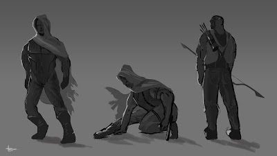
The Vigilante

Here I am beginning to develop my left wing vigilante character. Whereas my Capitalist hero is a celebrated CEO, his 'criminal' counterpart must keep his identity a secret, so much so that we only know him as the mayhem causing alter ego.

I first went with some rough silhouettes to see if anything interesting emerged. I took a hooded Robin Hood/ Green Arrow approach:


I used a Feng Zhu design approach, sketching quickly and blocking in, trying to establish strong silhouetts:


Interestingly, in this tutorial Feng talks about showing off the female form, as that's what sells in the industry. This seems like a very exploitative capitalist approach, using sex to sell. Perhaps with my vigilante I can instead break convention. I like how in the Batman franchise, The Joker rarely portrayed as a body builder, yet challenges Batman's physical and technological superiority using whit and cunningness.

I wasn't very happy with the above designs, as they felt very generic and uninspired. I wanted to keep the idea of the hood, but give a kind of gorilla protest vibe, wearing a cheap shop-bought novelty mask. I tried a quick scene concept depicting a hooded and masked vigilante standing up against a sort of authority. Again, at this stage I working loose and freely to see how my ideas develop:


I included some reference to surveillance within my city with the inclusion of cctv cameras. The low angle of this piece and the strong red lighting communicates some level of drama, but still here my ideas weren't fully formed. This led me on to some more critical mask designs:


From these designs, I liked the sad clown approach. I liked the feeling of torture and despair behind the concept, like an ironic spin on an upbeat tradition. It also has this level of ambiguity, that things are not always as they seem. We associate clowns with joy and laughter, but behind closed doors the comedian is often a tortured soul. I took this concept further:


With this piece I decided to also include a sinister clown painted on the back of the characters jacket, which I thought could represent a duel personality. The sad clown mask represents the notion that our government treats us like fools, and many respect this authority and play dumb in the pursuit of a trouble free existence. It almost equates to the medieval jester dancing around and performing humiliating slapstick routines for royalty, even though it may seem degrading and character compromising. The vigilante wears this disgruntlement on his face, challenging the elites who ask him to act 'patriotic' or oblivious. One criticism with many left wing protagonists, particularly ones that exist within western action driven narratives, is that their violence and physical displays contradicts their liberal views. The sinister clown painting acts like Bruce Waynes 'Dark Knight' alter ego. The fetishised violence could easily consume, and very much like Showtime's 'Dexter Morgan' he uses his lust for dominance and physical aggression to fight for a cause he sees fit.


Finally, on a more broad development note I have made some amendments to previous concepts. First of all, with the CEO's surveillance desk concept, I noticed anatomy problems with the narrowness of the character's neck, which I corrected. Secondly, I pointed out that my Capitalist hero needed a way to transcend the city that dwarfs the everyman. TO achieve this I did a paint over, adding futuristic armour to the currently named 'Cyclops' piece:


I went for a very spotless fantastic white approach as I thought it felt very sharp and modern, with subtle hints to the patriotic colours of the American flag. The Capitalist Hero uses jets in his wrists and boots to soar through the city and dazzle onlookers in celebration of western military technology.

Monday, 13 January 2014

Synthesis Presentation

One of our critiques came in the form of a group presentation. Our class was devided into two relevant groups, our group involving storytelling and narrative driven projects. The aim was to share our practical work, and discuss synthesis and how our essays informed the responses, and then gain feedback off of each other.

Some interesting ideas were raised by classmates relevant to my studies. One interesting concept raised was the 'Alignment Chart'. A 3x3 grid combining good, neutral and evil with notions of 'lawful' and 'chaotic', to create different character personalities:


Where this is interesting in my study, is that it moves away from stricter notions of good and evil, and introduces these more complex character traits. The discussion was raised that Jack Bauer from tv series 24 could be considered chaotic good, with the fact he goes to extreme violent measures to ensure the safety of many. Other suggestions on what to investigate included revisiting Minority Report, a film that deals with extreme surveillance where crimes are predicted before they happen, the Channel 4 show Misfits, which involves ordinary people with extraordinary powers, and also the show Heroes, which in certain story lines depicts villainous super beings in positions of political power.

A final interesting point that I definitely plan to explore a little more is the environment which my characters exist within. One suggestion was a large corporate towers similar to the Wayne Towers from the movie Batman Begins.

I find this type of crit session helpful, as they encourage us to share our ideas and give feedback on work of others. It's nice to receive suggestions from people who may be potential looking at the same theorists and ideas within their study, who can share knowledge. It also gives a good idea of the stages others are working at, which can help motivate and drive your project forwards.

Primary Research

I first began considering primary research for my extended essay by writing a survey. I was initially interested in the notion of consumerism, and how aware the consumer is of the ideological and political messages found in post 9/11 Superhero Movies. I wanted to get a sense how sympathetic the passive viewer is towards arguably unhinged and flawed characters such as Batman, who some argue uses his wealth to target street level criminals, instead of the elites who share his economic status and at times are the cause of oppression and crime among the less wealthy. I started with simple ease in questions such as:

'Would you say that you are an avid film viewer?'


'Which one quality do you believe makes for the most enjoyable viewing experience?'


Although these results probably would not relevant in my essay, I felt they had their place as they were starting to engage the participant. The questions I felt could be relevant were along the lines of:


Choose one of the two character descriptions below that would most fit your preference of a hero:

Uncompromising and decisive.

Tolerant and sympathetic.

Do you think that a superhero should?

Takes matters into his/her own hands.

Abide by and help enforce the law.

Here I am asking again how passively the viewer receives these ideology enforcing characters. Do people generally take a more conservative understanding, hoping to see caped crusaders beat up relentless unsympathetic villains, or do they like more ambiguous narratives where the hero and villain have a challenging moral dynamic? Not only are these questions more relevant, but the multiple choice aspect breaks up the process with the hopes of keeping people engaged.

Although I created this survey, on reflection I felt that quantitative data didn't really suit the tone of my essay. My essay mainly considers narrative, and the intentions of the writers and directors cited, and I couldn't foresee a chapter on movie goer's habits. Reflecting at this stage after finishing my essay, perhaps I could have attempted to shoehorn some data in when speaking about left and right-wing storytelling, but at the time I was swaying more towards the idea of qualitative data perhaps from writers.

I did attend Thought Bubble comic book convention in Leeds, where I attempted to network with writers and illustrators, hand out business cards and discuss my dissertation. I struck up a conversation with oil painter and creator of The Jaded Enemy James E. Snelling, who told me he might be able to put me through to a lecturer who discusses politics in popular narratives. I left James with a card, but unfortunately didn't hear back from him. Although I could of probably searched online for his email and dropped him a reminder, I came to a doubting sense that I had nothing interesting to ask. This happened also with Twitter. Although I had added comic book writers with the intention of engaging in informative exchanges, I always went back to this pessimistic idea that I didn't have anything I wanted to find out. I could have taken the 'Do you have an opinion on Superheroes enforcing political agenda?' route, but it seemed too broad and I couldn't really think of a way to narrow done the discussion point.

The main problem was that my subject has been heavily discussed, and it seemed that I was never short of great secondary sources. I still feel that in the end I made some interesting parallels of my own, but it would have made the essay feel more progressive if it had included some original thoughts and reflections from those in the industry. If I were to approach this project again, I would definitely try pin down a unique point or observation, and try and get some relevant quotes from primary sources.