Showing posts with label OUDF603. Show all posts

Wednesday, 14 May 2014

Specular Mapping

We had already discussed the possibility of bringing in normal maps (specular, bump etc...). We have already established a flat cartoony style, and didn't really want to over do it with bump maps and make it look too gritty or realistic, but Annabeth did suggest that we could experiment with specular maps to distinguish matt surfaces from metallic ones. I applied this to a Weapon of SASS Destruction turnaround I had thrown together earlier in Unity. I found that you could only bring in separate normal maps to work out the bumpiness of a shader, for example specular bump. The flat diffuse specular applies shininess to the entire mesh unless otherwise influenced by an alpha channel within the material. This means again, similarly to when working out the transparency, I am using Targa files:


Here is the channel from the Targa file. The lighter areas indicate where the mesh will be more shiney and reflective, I really tried to put a cartoony exaggeration on the reflectivity on metallic objects like the guns and ammo belt:


Notice in Unity I knocked back the main colour to a light grey and upped the specular colour to full white to further the strong highlights. The gun and ammo belt in frame here are clearly much more sharp and reflective than the matt body of the mech. Again though, we are working with large Targa files, so in terms of efficiency we will probably have to keep the amount of objects with specular shaders to a minimum. I suggested we have the mechs and copper pipes the player passes through as reflective objects, and maybe the wrecked vehicles.

Transparency Issues

The issue I hit with transparency within both Maya and Unity was that when applying a PNG or Targa to the entire mesh of say the 'WoSD,' was that the faces from the back of the mesh like the ammo canisters could be seen through the front faces:


Here the ladders above the left gun are a single plane that require transparency for the gaps in the steps. The simple solution seemed to be to apply a separate transparent texture to only the ladders, using a .jpg for the rest of the body. However, this presented a strange white aliasing problem. Some research on the Unity forums brought me to the understanding that where values are semi transparent, Unity works out the values in between are white, as if the image is sitting on a white backdrop: this video explains it well:


I followed the instructions, downloading the plugin that allowed for the solidify function. The results were successful. The problem however, was that I was using Targa files to enable Unity to read the attatched alpha file, while preserving the bleed created by solidifying the images. Targa files are quite large, and considering I had an entire Targa image for say a spider mech wheel, this was going to be a highly inefficient approach:

Here is an example of the stain glass windows Targa file. As you can see there is a lot of wasted space on a file that is 16.9mb in size.

I had to find a more efficient way to include transparency into our game level. The first obvious approach to include all of the transparent game objects on one UV map. To do this I imported all of the FBX files with transparency into one scene, and arranged a new map with elements like wheels and vandalism:

This shot highlights the white aliasing issue to the right. For some reason, where on my mac book the PNG created the same white alias, here on the university's computers the PNG to left works.

Despite the PNG working okay, I decided I still wanted to use the Targa file format. As I am using also semi transparency, and not just full transparency in the empty spaces, I like to have the alpha channel so I can tweak and control transparency levels with for example the Nighthawks' windows:

There is still unused space on the UV, but having all of the transparent faces on one map is much more efficient. I didn't have the solidify plugin on the university computers, so did a simple method of bleeding out the colours by hand using a soft brush.

Here is the alpha map. The white areas are fully visible, whereas the black areas cannot be seen. The grey areas are semitransparent. I have also just realised that I have missed the transparency and colour bleeding of the bottom stain glass window plane, something I will amend.

While I am on the subject of efficiently, Adam was in charge of UV unwrapping, and he sent me some really nice and efficient UVs. Occasionally however, I would unwrap simple block assets like walls and floors, and I feel I could have been much move efficient:


Again there is a lot of wasted space on this, and with simplicity of the designs, some of the faces could have shared the same planar projection. 


I was more efficient with this container UV, sharing the same projection for 3 of the 4 longer faces (apart from the one with the Nasti Moons emblem), and using using one projection for the square end faces.

Also, with smaller assets like this one, perhaps I could have taken the UV snapshots at a smaller resolution. Generally I projected at 2048x2048, sometimes 1024x1024 for smaller assets. Perhaps I could have used even smaller resolution projections for the smaller less detailed assets to further efficiency.

Building Textures

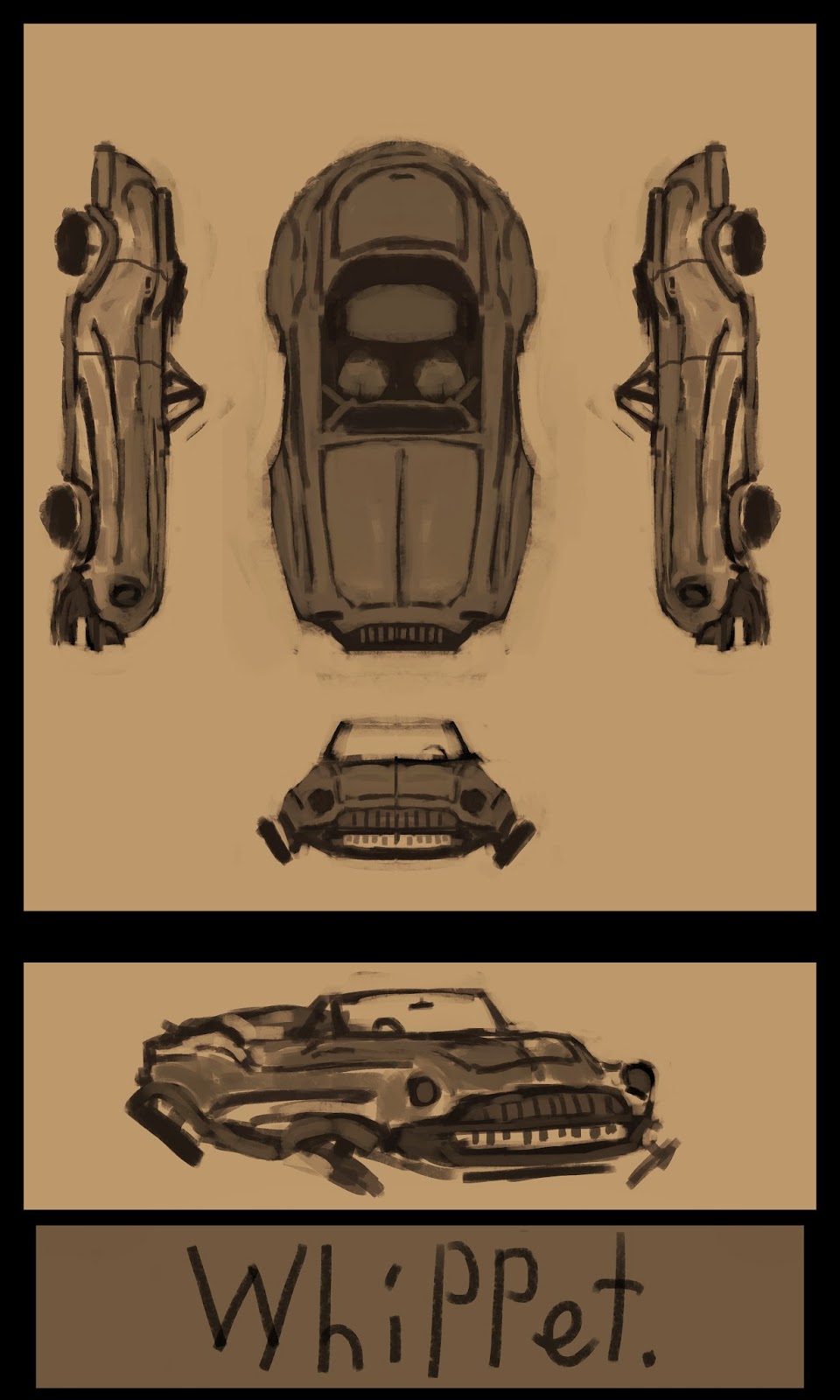
As mentioned earlier, the game level now takes place in a SOI city (Leeds) which has been overrun by Marauders. I wanted to nail down a general style for SOI architecture, so began by painting two generic buildings sent to me modelled and unwrapped by Adam:


We had already discussed that the Leeds Market building would be a good source of reference. It has an interesting old victorian feel, consisting of lots of iron arches and supports giving both an elegant yet industrial feel. We thought this style would suite the resourceful Sons of Iron quite well. I grabbed some images from google:


As you can see I have also included a brewery cask and a dramatic painting to bring in interesting and vibrant colours. I feel I went into quite some detail with these structures:


I included elements from the Leeds market hall, such as the blue supports and burgundy strip with gold decorations. This contrasting with the grimy weathered stone and dirty copper brewery casks bursting through, gives both elegant SOI and chaotic Marauder characteristics:


I also created a dirty water stain effect around the brewery casks using a soft muddy brown brush, and then applying the smudge tool:


With this subject matter, there is a constant struggle between vibrancy and grittiness. The marauders are an unsanitary beer guzzling faction, laying waste to once beautiful architecture. Despite the grizzly setting of a war torn land and the bleak industrial North, we actually want the aesthetics of the game world to be bright and fun to look at, very much like the 'Borderlands' game franchise. I actually feel that the strong blue iron girders and complimentary orange copper casks help maintain the balance and keep the style fun and vibrant. The details such as vomit coloured moss, dirty cracked stone and water stains gives us just enough to communicate bleak chaotic times without loosing the fun.

I believe also that the heavy black outlines help give an instant comic book effect, also making the forms seem more punchy and exaggerated:


I also decided to build some modular image planes which I dubbed 'Vandalism' parts, to further the level of Marauder impact on the regal SOI architecture. I mixed the colours of both clans, the 'Crimson Teeth' (red) and 'Nasti Moons' (yellow). I also included a fence spike piece to have abruptly jutting out the walls:


On another note, there was come confusion regarding the roof of the tall building. The original model didn't contain a roof and was hollow at the top, presenting issues obviously with backface culling. For this reason I quickly added a spire roof, but it turned out that the tops of the taller buildings would not be visible. Based on the camera distance from the the player character on the test levels, I assumed the buildings would be in full view, but it turns out the scale will be upped and the camera moved closer, which in my opinion is better. The added roof did come in handy however for a rendered out shot I did of the textured and vandalised buildings I produced to be used as a promotional image:


Backface culling was an issue when I turned on the backface culling shader in maya. For single planes like on the street lamps (which you will see in a moment) I duplicated the faces, reversed the normals and them combined them both.

With the the Sons of Iron being a religious faction, it was suggested that stain glass street lamp decorations could offer a splash of colour and interest:

Reference


With the street lamp decorations, I went for an industrial/ agricultural feel, as if the SOI faction are celebrating their technological advancements. I could have had the stain glass plates cracked and damage by the marauders, but I didn't want to loose the vibrancy and vividness of the designs.

After completion of these standard SOI buildings, I could efficiently apply the same style to others copying over the layers and using the clone stamp tool:


For this pub building I tried a slightly more traditional victorian style with the blue decorative trims, more like the 'Victorian Street' environment concept  piece I produced during the R&D phase.


Notice here that I brought back some subtle art deco elements with the door and decorative small blocky structure directly above the door. It's fun how I am able to combine all these different architectural elements to try and create a unique aesthetic style for the SOI. I think the key with the SOI, being a conservative yet technologically advanced faction, is to try and achieve a new meets old look. The art deco seems suave and classy, against the old industrial iron girders.

That is not to say that we followed this set style for every piece. Adam sent me a building that he had dubbed 'Nighthawks' bar, along with the painting that inspired it:


I liked the mood of the pice, and thought the oranges might match some of the brewery elements, along with the greeny blue theme we already have, so I used these colours:


I painted the font by hand, using reference:


The petrol station below is titled 'Conch' as a humorous play on oil company 'Shell':


Notice how I used phototexture with the brick, taken from Tim's reference photographs taken at the Canal in Leeds. I introduced more phototextures later on, for reasons of both efficiency and also a more dynamic less flat style.

On another note, when rigging the Mechs, it was important that I maintained good practice (naming the conrols and joints conventionally, Locking off controls with the limit attributes function to prevent the rig from breaking...) so that I could pass the rigs on to Rhys for animation. With me being the sole texture artist, my approach was much looser. I used lots of unnamed layers, organised only in rough folders:


This was I okay for me, but I remember hearing artist Titus Lunter speaking about how he once did a job where an experienced artist who was new to digital art passed on a file convoluted with many tiny layers, and Titus spent half the time organise the work before he could paint over anything or make tweaks. This is definitely something to consider if ever I am producing images that could potentially be passed on to other artists.

Monday, 12 May 2014

Rigging Issues with the Spider Mech

On top of the main WoSD, I was also assigned with the task of rigging and texturing Adam's spider mech model. The original concept came from a painting produced by Adam in the R&D phase. With the deadline creeping up, we have accepted the strong likelihood that we will only be able to complete one playable level. The Spider Mech model was created early on, and Adam had the idea of including it as a SOI machine highjacked by the Marauders. This way the SOI lore is still present within the Marauder game level. The stolen Spider Mechs are owned by the 'Nasti Moon' clan,  who adopt a yellow colour scheme:


There is a conscious decision whenever a Marauder clan emblem is drawn to do it loosely freehand. It gives this quickly painted on look fitting the Marauder's chaotic character traits. The Marauder Spider Mech includes also a wooden beer cask, fitting with a new narrative where the Marauders have turned the city into a giant make shift brewery. On this barrel you see the Nasti Moon's clan emblem.

The rig itself for the spider mech was fairly straight forward, using single Ik handles with the standard three joint humanlike legs:


I hit trouble when painting out the influence of the legs on the body of the spider mech. I quickly discovered that I needed to physically hide the legs as to not paint out the influence on them when trying to get to the body. I had the leg meshes on a separate hidden layer originally. The major issue however was that Maya kept crashing when painting out the influence. I researched the issue online and made some attempts to put less strain on Maya when painting the mesh. Firstly I went into the preferences and deactivated the undo feature so that Maya was no longer trying to remember 50 stages while using the 'paint skin weights' tool. Secondly, I toggled off the 'construction history' feature:


Unfortunately this didn't resolve the issue, and I kept getting error messages. The only solution was to reduce the size of the brush and paint carefully, trying not to influence too many vertices at once, and to save very regularly. On reflection, we are working with very simple low poly models, so the weight painting shouldn't have really caused problems. Speaking with tutor Matt, he explained how others had reported similar struggles when weight painting in the Maya 2014, and that could be accredited to a bug. Unfortunately this glitch made the process much more drawn out than it had to be, causing me to have to boot up Maya and reload the scene repeatedly after a crash.

Matt also noticed an issue with the weight painting of the legs:


Notice how the influence from the knee joint is causing the end of the first leg mesh to bend up. I realised that I needed influence running down the leg mesh from the leg joint, and same with knee mesh and knee joint, as shown below:


The gradient mode also shows blue influence on other legs, and there was also some unwanted influence affecting the front of the body and the wheels. Rhys offered to complete the weightpainting before resuming his role as animator. This is where good practice and naming conventions were important with the rig enabling Rhys to navigate around the model and work efficiently. 

Friday, 9 May 2014

Texturing and Rigging the WoSD

Now we are in to the building phase, we have begun nailing down a pipeline for efficient workflow. Tim and Adam have been doing most of the asset modelling, Adam has bee unwrapping the UVs, Rhys has been animating, Tim has been building and coding in Unity with support from Adam and I have been given the role of texture painting, and so far some of the rigging. We thought that by having one artist on the textures, we would be able to maintain a consistent style. We have also opted to carry the outlined comic effect used for the wrecked whippet which we weren't 100% sure of. We feel it makes the game look more distinctive and visually interesting.


With the 'Weapon of SASS Destruction' being such a key asset, we had a clear concept so there wasn't too much need for experimentation at this stage. I simply had to clean up and paint the textures from the turnaround I had created earlier. Painting textures offers interesting challenges. Obviously the shadows are determined by lights placed in the game engine, so I had to not include any hard shadow, without the textures looking flat. Obviously there are other  ways to achieve the illusion of depth and texture such as bump mapping, but our game isn't ultra realistic, so we won't be relying too much on that.

One of the greatest challenges at this phase came with the rigging of the WoSD. I essentially only needed the legs rigging with a single joint to control the upper half of the Mech:


I hit trouble when weight painting the influence, as the heels of the mech seemed to peel off the ground, and the foot would loose volume when I moved the foot controls:


I couldn't figure out why the influence was so off. My methods became unorthodox, using distant joints to pull on vertexes like for example: If the knees were distorting, I'd try and resist it by bringing influence from the toe joints. I also toyed with the idea of bringing in a heel joint to help keep the volume of the foot, but tutor Matt a shored me I could achieve what I was after using weight paint influence. When looking at the rig, the first thing Matt noticed was that I hadn't been using IK joints correctly. Using a standard human leg as an example, an IK (Inverse Kinematic) joint should run from thigh (leg joint) to the ankle joint. I had 3 IKs in the dog leg style rig, running from the leg to knee, knee to calf, and calf to ankle. The Iks however should have been running from Leg to calf and knee to ankle. It turned out however, that Maya has a spring IK, which is designed for things like spider legs. One spring Ik running straight from the leg to ankle joint worked out all the joints in between nicely.

The strange folding and distorting of the knees was still an issue at this point. It turned out that because the model was so low poly, there was no blending between joints. I simply added in some edge loops around the joints to help the knees maintain form. With the IK handles and mesh sorted, I could now revert back to weight painting sensibly. I used the gradient view to ensure there was no unwanted influence.


I presented Rhys with a conventionally named locked off rig:


I feel I am really beginning to understand weight painting. I got rather tied up with a flawed rig, but demons aside the process of determining influence on vertices from joints is fairly simple. On a personal note, perhaps I could have named my scenes numerically (01,02...) as it got confusing at points:


As far as following naming conventions however, I feel I kept quite an organised and mostly orthodox workflow, naming my joints clearly and working out an appropriate hierarchy.

Wednesday, 26 March 2014

Moving Forward after 'R&D'

Now we have reached the end of our research and development point, I have been reflecting on moving forward with the project, and how we may need to approach things slightly differently with the building phase.

To this point, there has been lots of focus on production pieces and developing the unique IP. I think the first significant shift in my work will come with the more technical aspects such as Mech turnarounds, paintovers and UV textures. We have already started visiting this with the initial assets and WOSD turnaround, but I think a key area we are lacking in is environments that show the game space. Rhys began blocking in Unity and playing around with the camera, so I think the next important stage will be to produce paintovers that give a sense of how the level will look for the player. I have created lots of eye level environment concepts, whereas the player will have more of a birds eye view looking down, meaning rooftops will be a big focus aesthetically.

Another aspect we will need to consider, is creating an efficient pipeline. I will be producing most of if not all of the Mech turnarounds, and painting the textures. This may leave me with some time to model minor assets, but the turnarounds and textures take time, so I will likely be focusing in those areas. Adam is a fast and confident 3D artist, and also has experience efficiently unwrapping UVs. Tim and Rhys also have experience particularly with hard surface models and in Unity from previous projects, so will likely be working on the environments. Tim and Adam are both sharing coding duties. Although these are not strict binding roles, hopefully it should give us some sense of efficient workflow.

Ultimately, I will be happy as long as 90% of my focus is on painting textures and creating concept art, that is considering Adam is happy modelling and texturing for the majority. We did both come into the project with concept art as our key skill, and I do not want to hijack all of the Photoshop aspects moving forward. I feel that now creating an effective pipeline should be our key focus if we hope to create 2 rich playable environments.

Early Texture Test: The Wippet

Recently Adam designed and modelled a wrecked vintage car as an asset for our street level environment:


As you can see, Adam has been considering efficient UV mapping, dropping in a grid texture and trying to achieve nice even squares using planar projections. The resolution of the hood however was inconsistent with the car body. Also, discussing efficiency within the game engine with Matt, it was brought to our attention that instead of having everything everything separate like the car doors, seats etc... it would be much more efficient to have everything on the map. This meant everything needed to be unwrapped before he textures could be painted, a role which I took on while Adam got to work unwrapping the WOSD:


I thoroughly unwrapped most of the elements, although for the smaller assets like the headlights, wheels and engine in the hood, I simply picked a plane that showed the most predominant faces, object selected and planar projected from the camera view. This is quite a small asset, and I didn't want to clutter the UV map with tiny unwrapped assets that the player wont see in detail. Any subtle stretching is either on parts with low detail textures anyway, or out of the general view of the player:


I grabbed some reference for colour and style:


My aim was to create a rusting yet vibrant feel, inspired particularly by the blown out oranges in the top right image:


I created a layer mask that masked out everything external to the UV outlines and worked loosely with a blend of rust phototextures and custom brushes. For the chipped paint effect I added a mask using a particular texture brush to give the illusion the paint has been scraped away. I was originally going to paint out the details, but decided to experiment first with the 'Backwater Gospel' outlined look:


This final image showing the engine in the hood of the Whippet, gives a good example of how a small asset doesn't require intricate detail, so can be simply planar projected and assigned a basic texture.

I have shared the stylised outlined approach to the group, and it was met with fairly positive response, although the final style of the game may still be subject to change.

The Weapon of SASS Destruction Turnaround

Perhaps one of the intricate and considered processes I have been involved with thus far, has been the technical drawings for the protagonist's playable Mech (WOSD). We had a discussion on the style of the Northern Resistance Mechs. Referring back to the Design Specs written by Tim, the Resistance, although embodying an aesthetic military image, actually use re-serviced agricultural Mechs. To this point I had been considering the Mechs more as walking British tanks, and we wanted to go back to a vintage truck approach. We actually began this discussion on 'Skype' where we shared images:


I begin by throwing down some fast loose silhouettes:


It was agreed that the second from the left on the bottom row was the strongest design. One of the most notable features with the new design approach is the large grills and headlamps, something very vintage car inspired. I took the chosen design into Photoshop and made some tweaks. Firstly, with the legs virtually on the sides of the cockpit, the upper body wouldn't be able to move independently, so I raised the body. I also moved the guns to the sides of the cockpit. To speed up the initial design process, I laid down photos on top of the silhouette to achieve fast detail. Bellow shows the stages of the initial WOSD design:


The team felt the fist design was too narrow, so I simply adjusted the scale. Tim also suggested I add a smokestack and lengthen the guns. Secondly, we decided to more the fans to the back of the design, and raise the guns to be more level with the headlights. Finally, we doubled up on the smokestacks and added ammo belts running in to ammo boxes mounted on the Mech's rear. Notice also the Manchester county flag personal to protagonist Rachel Chadwick who is form the city originally, utilising this idea of customisation toward the Mechs. Below is the reference used for the turrets:


With the general design of the WOSD captured, I began creating a technical turnaround, measuring everything to scale using the guides in Photoshop:


One of the quirks of our IP, is the inclusion of male pinup models, an idea thought up by Tim and favoured by the female characters. This allows us to turn gender convention on its head. For Rachel Chadwick's pin-up, I wanted to create something bizarre and with a Northern tinge. So I applied a bearded bitter drinker to a classic Bettie Page pose. I went with the Martini glass burlesque routine, with the Martini glass swapped out for a classic pint pot:


I also replaced the stirrer with a pick axe, as a shout to Northern mining culture. This design was then applied to the final turnaround:


Working on the technical turnaround was a great experience. I have been focused on working fast and loose as of later, but this is a process that just cannot be rushed. I had to tediously make sure everything was lined up to make the modelling further down the pipeline as problem free as possible. Because of this different more intricate approach, I felt this piece could feature in my portfolio to show versatility. For this reason I tried to present it well, including the initial photo thumbnail, the turnarounds and a separate render of the pinup logo. I also overlaid a previous environment piece to add a little bit of noise to the backdrop, making it look less flat and the turnaround pop.